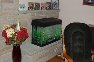
The fish tank on the other side of the fireplace:
 The green rocking chair will eventually be going up to Thumbelina's room, but her room is still awaiting carpet to be laid before the furniture can be placed... OH and the flowers ~ I've had the vase for a couple of years and just never got around to putting anything in it before today ~ dollar store flowers, but I love how it's starting to look. I cleaned out all they had of flowers in these particular colours but you know I'll be going back soon to fill up my vase.
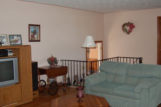
The view of the living room from beside Husband's chair: The tea wagon belonged to my Grandmother; I'm not sure I like that spot for it but for now, there it sits.
A close-up of the flower arrangement on the wall: I made this and another one identical to it for my Dad's grave...of course somebody stole the one on his grave a few months later...I knew it would happen ~ that's why I made one for myself...
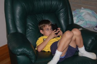
And lastly for your viewing pleasure:
The part I love about my living room is the hardwood floors. With 3 boys and living on a farm, I can't imagine having anything else. What I DON'T like about my living room is the fact that the fireplace covers the entire length of the wall. I would love for it to be a normal-sized fireplace with shelving or cabinets with glass doors on either side of it. It makes it hard for furniture placement. And I just moved my Live Laugh Love picture to that spot above the fireplace this morning ~ there was a clock there and I'm still checking that spot to see what time it is...never mind there's a watch on my wrist...and I don't like the top of the entertainment centre...seems too blah to me. Anyway, thanks for stopping by!


5 comments:
Your fireplace is just gorgeous! So are your hardwood floors. And I've never seen a tea wagon before- love it!
Okay- coming from an Interior Designer- here's a few tricks to help out;
Odd Rules.
This means things should be placed in odd numbers. Three of this here, five of that there, etc.
Vary Heights.
You want something tall, medium and short on table tops, etc. It's pleasing to the eye and leads you to the next object.
Eye Height.
Pictures and such should be placed at eye level. If you are 5' and the man of the house is 6' then place things at 5 1/2'
And your living room is beautiful. I love the wreath!
Thanks for the tips - I need to take someone smart shopping with me =) and get rid of the pictures on the mantle; they're irritating me because I know it looks too cluttered.
You have a lot of symmetry going on.
I absolutely love your rooster pictures! My mom has roosters as her theme in her kitchen and dining room (it's a combo room). It's just very home-y, you know?
Have you thought about putting the pictures on the wall(s) in the stairwell? Two or three pictures per step?
The chicken and rooster are actually cross-stitched by a friend of mine. They are fantastic! I do like the look of a stairway-wall lined with pictures but I imagine them being bumped off the walls by the boys and crashing and falling to a hideous death. The pictures, not the boys.
Post a Comment